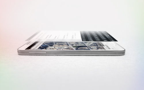
Graphic designers with a lust for lettering are constantly seeking scripts balanced neatly on the sweet spot suited for exuberant editorial work and messages of cheer. Neither frivolous nor strict. My typeface, Gioviale, satisfies that need. Your work may call for a script that is handsome without being overly formal, that is merry, playful, and, like a good Italian pastry dough, hasn't been overly handled until it is left stiff and flat. Use Gioviale to create something tasty, al dente, a touch ornate yet fluent and full of life. Its versatility is exemplified in its greater readability at small sizes compared to other scripts, as well as the included alternates and swashes. Scripts with a hand-lettered look often take on one of two personalities. Some are formal, with heavy flourishes that threaten to sacrifice readability. They are regal, make a statement, yet are so meticulously constructed that they seem chiseled in stone and inflexible. But, oh how exquisitely beautiful they can be. What’s the usual alternative? Italic text faces. Though modern and readable, with the little twist that italics carry, they can have a manufactured appearance, a mass-market profile that robs your work of the personable quirkiness of the handmade and unique. But, still, they cast a respectable, clean, and professional profile. What inhabits the space between these, an uncompromising tool that, in your hands, conveys conviviality, grace, and spunk? Gioviale glides in to fill that formerly scanty typographical niche, a hybrid of an italic text face and a script, flowing with flair and elegance, and, somehow, carrying just a hint of tailored and clean, structured underpinnings. It reveals that elegance needn't be serious, just the result of serious craftsmanship. Indeed, Gioviale was inspired by a simple and spontaneous burst of joy in my own craft. Conceptually, my process was reflected precisely in the outcome, perhaps because it mirrors my own personality in so many ways. Despite the due diligence required, this typeface came more easily and naturally to me than virtually any other I've created. The heart of it burst onto the page breathtakingly fast compared to my other typefaces. I wanted the look of a roman italic without pausing to build a roman counterpart (perhaps I'll design one in the future). I looked to the Italian Didones, popularized by Didot and known for their very high contrast thin thins and thick thicks. True to its nature, Gioviale is a less serious interpretation of the Didones, and its uppercase letters are a departure from classic precursors. Gioviale includes a User’s Guide, 1008 glyphs, an entire alternate set of swash caps, 20 ornaments, 20 discretionary ligatures, and an unusually high number of swashes (300), which include a standard uppercase set for more traditional text settings, and a swash uppercase set which are even more flourished. Why not? To joy!
OTF | 2 Fonts | JPEG Preview | 5.1 Mb RAR
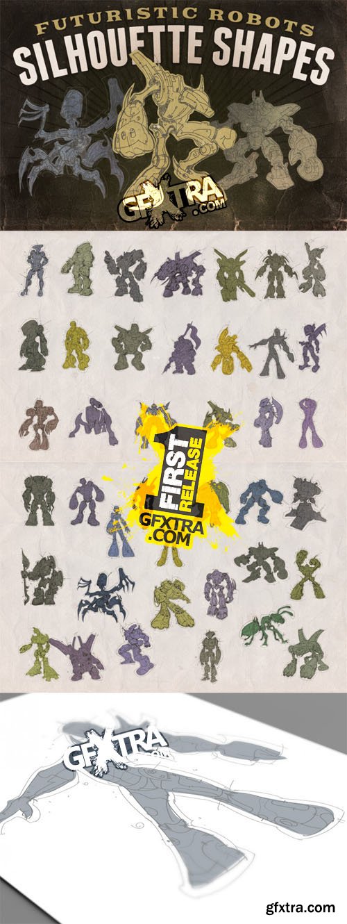
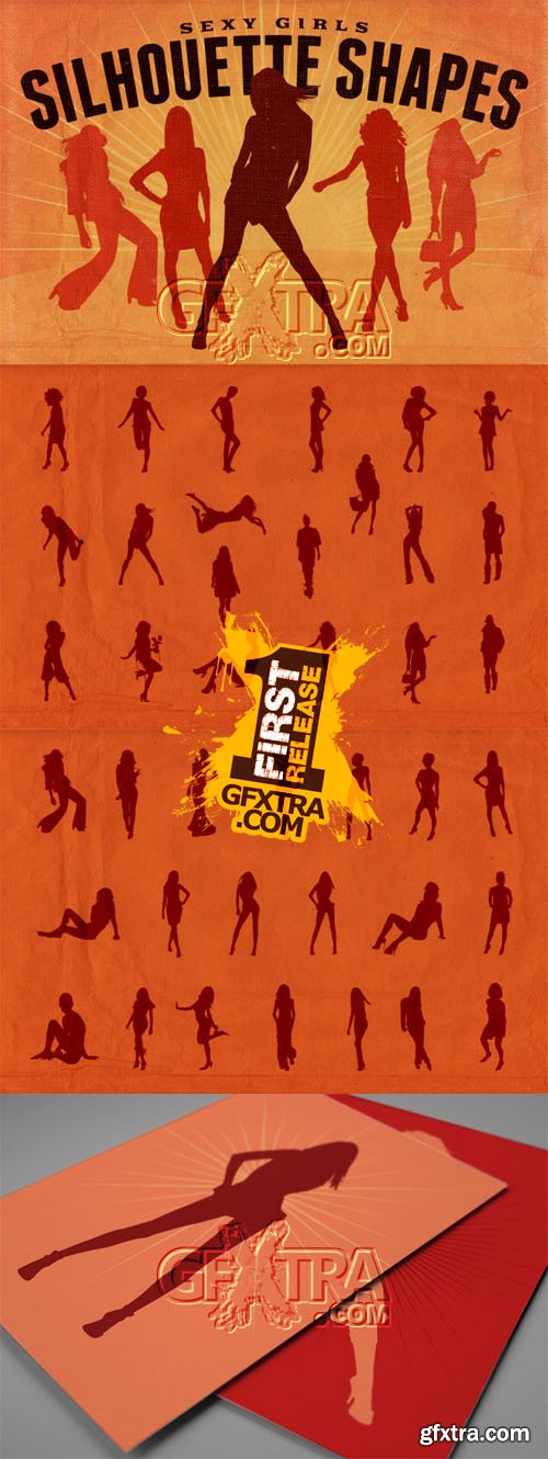
25 EPS Vectors in Original Filenames with JPG Previews | 227 Mb RAR
PSD, PNG | 11,3 MB
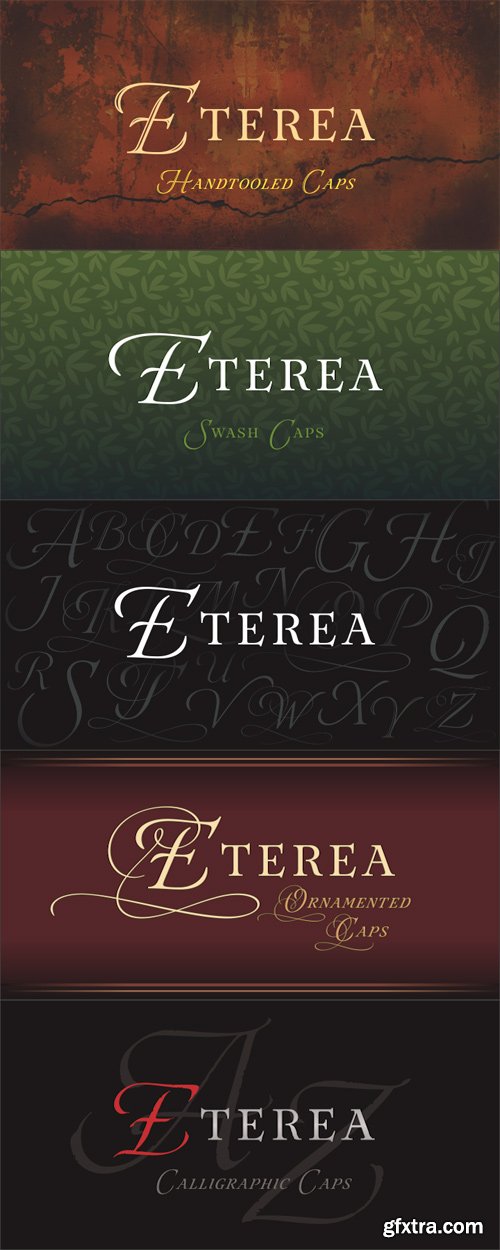
Eterea is a formal font inspired in the monumental inscriptions of classic Rome, but not strictly sticking to the ancient roman typographic characteristics. Its unique look is the result of mixing diverse typographic styles, but mostly having traces from the 16th century transitional style. It bears a big difference of proportion between upper and lower case, additionally to the upper case having much more ornamental traces. Eterea has four different flavors of capitals which change very slightly in the cursive versions. In the italic versions, the lower case (actually small capitals) changes substantially its characters to make its reading more flowing and is not simply an inclined version of the letters. Eterea is a very expressive font, ideal for tittles and short texts of sober and elegant appearance.
OTF | 12 Fonts | JPEG Preview | 4.5 Mb RAR
PSD | 14,7 MB

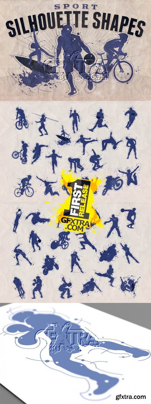
PSD | 44,4 MB
PSD | 124 MB
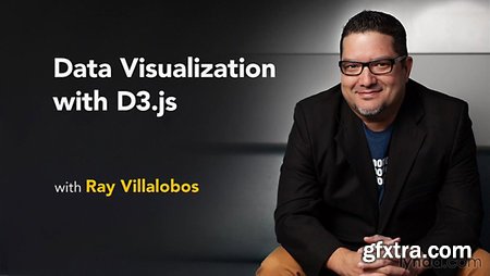
Duration: 3h 20m | Video: AVC (.mp4) 1280x720 15fps | Audio: AAC 48KHz 2ch
Genre: eLearning | Level: Intermediate | Language: English
Creating data-driven visualizations and infographics that run on multiple devices responsively is a tough challenge. The D3.js library has revolutionized visualization by making it easier to parse your data and add meaningful interactivity. All you need to bring your data to life is D3, plus a bit of HTML, CSS, and javascript, and some SVG graphics. In this course staff author Ray Villalobos explores how the D3 library works, and how you can use it to parse data from different sources and create interactive, visually exciting infographics and visualizations.

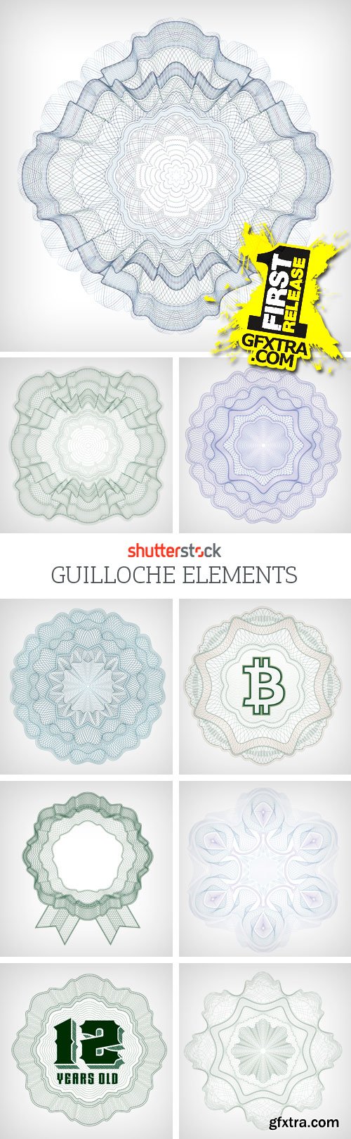
PSD | 19,2 MB
PSD | 35,9 MB

UserPro is a full featured user profile and community plugin for WordPress. It offers beautiful front-end profiles, login and registration for WordPress. UserPro is packed with so many features and control, It is more than just a user profiles plugin, with UserPro you can build your own community of searchable members directory, and give each user a customized, elegant profile - plus frontend, customized registration and login to your website. Your users will not know that you are using WordPress.
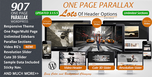
Great one page WP theme with tons of options and features. Not only will the PARALLAX feature be on the main one page, but you can also select a DEFAULT PARALLAX section and even a "page section" to be displayed across all other pages... AND You can change parallax/page sections per blog post/pages, choosing a different one or setting to none.
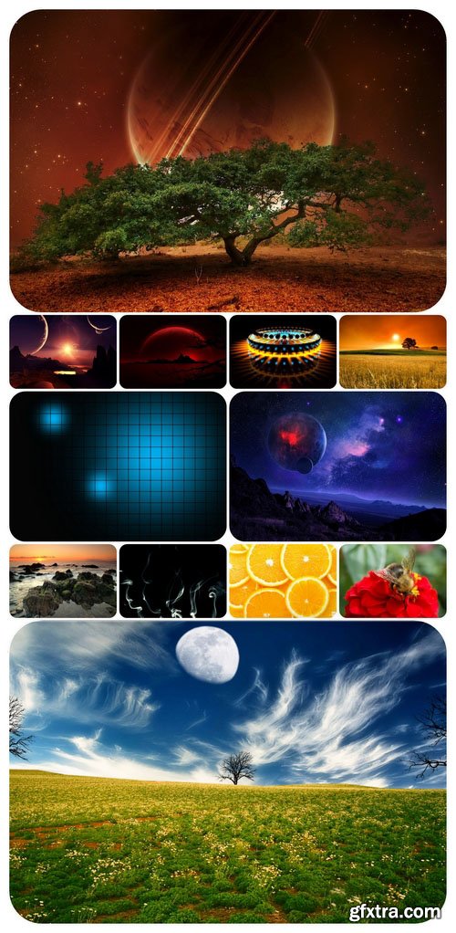
It's hard to compete with nature in diversity and man has still much to learn from it. We are not able to create the Earth in seven days, but we can imitate some of its natural phenomena in digital art.
SermonBox - Seasonal Collection

SermonBox - The Series Pack Collection

Top Rated News


Would you like to be a Author?